An Ambiguous and Composite Building is one that appears to be composed of multiple buildings and difficult to discern as a single entity. Very much like a chameleon will adopt the color and pattern of its surroundings, so an ambiguous and composite building will contort to relate to aspects of its context to ‘fit in’. Being polymorphic, or polylingual, or both, this is accurately a form of ‘urban camouflage’ that makes these buildings difficult to define and perceive as a single entity.
There are many situations where this kind of design strategy might be employed. These may include instances of an irregular site that suggests an irregular building footprint and massing. To make the irregular massing intelligible may involve designing the building to seem to be an agglomeration of discrete buildings. Another instance may be that the building is over-scaled for its context. In this situation, the building may be broken down to seem like an assemblage of smaller parti-wall buildings even though the footprint may be regular. It is also possible that this design strategy is internally driven. For example, it may be the design narrative that informs the building may suggest that it have the outward aspect of being built over time.
But the most interesting example remains the one whereby a building transforms to specifically address varying surrounding contextual conditions. These buildings can project very different appearances to very different contexts. The way the buildings address the context may even clarify it, by defining it and then supporting it. In this case, the buildings can be less coherent, so the context around them can be more coherent.
For example, the building sits on the corner of a commercial street or open space plaza (or park) and a residential side street. These two contexts require different design approaches. The uses and ground floor frontages will be different, one perhaps a commercial frontage with storefront and hardscape and the other a residential frontage with door yard or stoop. The height may be different; the building may step down to relate to smaller buildings on the residential street from a greater height on the commercial street. The character could be different; the commercial side may be more demonstrative, and the residential side more restrained. The two facades may or may not be in the same architectural language; the commercial may be more contemporary, the residential more traditional, etcetera. The skill of the designer demonstrates how effectively this is accomplished.
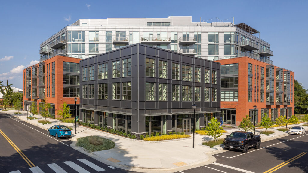
To be sure, many buildings are designed to employ this technique, but the strategy needs to be more widely recognized and utilized. The notion is essential in urban work to craft buildings that provide transitions between disparate contexts and are sympathetic and articulate in relating to those contexts. The composite building can address multiple urban design conditions through its flexible approach to building form and architectural language. The Muse in Alexandria, Virginia is a such composite building.
The Muse is a carefully crafted, mixed-use building located at the north end of the North Fairfax/North Royal Street ‘Arts Walk’ in Alexandria and immediately adjacent to the Mount Vernon Trail. The location within the city, the specific geometries and adjacencies of the site, and the building’s program are all factors that influenced the form of the building.
The three-quarter acre triangular parcel is situated between radically different contexts. North Royal and Third Streets form the right-angle corner of the triangle and are part of the historic street grid and small-scale building fabric. The hypotenuse is formed by the former railroad track that serviced the Potomac River Generating Station (PRGS) that is now a part of the regional Mount Vernon Trail network. Across the trail is located a regional Potomac Riverfront Park and a large development is being planned to replace the PRGS. The building heights being planned exceed 170’.
The Old Town North Master Plan designated the height for the block to be 77 feet, with a 50-foot height limit on North Royal and a requirement for a “transition” on the Third Street side. The master plan illustrated a 77-foot tall, L-shaped building with a façade stepdown to the two streets and a residual courtyard facing the trail. As this spot is along the city’s ‘arts walk’ and previously the site of the now relocated MetroStage Theatre, there was an expectation that the project would incorporate an arts and culture anchor.
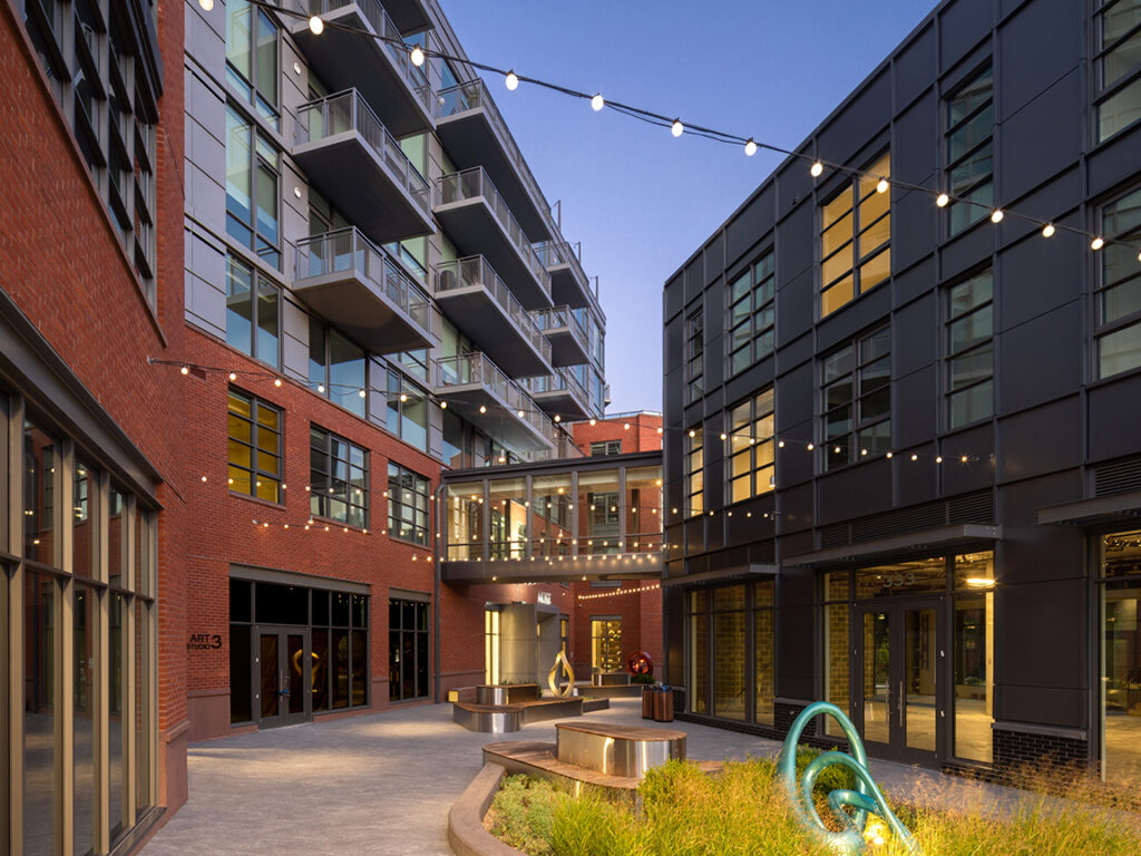
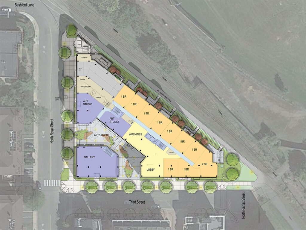
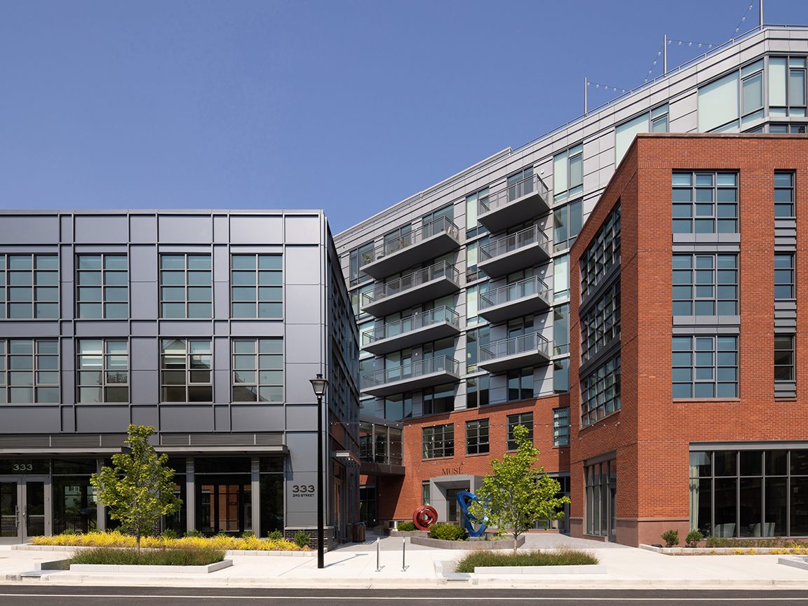
As designed the building proposes a robust urban design strategy as it makes the transition through building height and massing, urban public space, architectural language, building materials, and ground floor uses. It is a composite building comprised of an 89-foot-tall linear bar building (12 feet of additional height granted in the process for civic contributions), 4-story ‘shoulders’ that step the bar building down to the 3-story “jewel box” building on the corner. Between the two lies a two-sided, open-air, public passage that anchors the north end of the North Royal Alexandria Arts Walk. It is an open-air sculpture gallery, venue for events, and accessway to the exhibition space and studio space provided on the ground floor to either side.
The master stroke of the design, in a departure from the master plan, was to locate the midrise bar building parallel to and fronting the Mount Vernon Trail. At once, this took advantage of that portion of the site that permitted the tallest building to maximize the program, and freed up space on the site to deliver the arts walk exhibition space and the corner gallery building. The three parts of the composite building address the adjacent contexts; the historic building fabric on the city streets with the jewel building on the corner, the transition from the street and jewel building to the brick ‘shoulders’ that step up a story and line the midrise, and the glass midrise that offers expansive views over the parkland and Potomac River to the Washington, DC skyline.
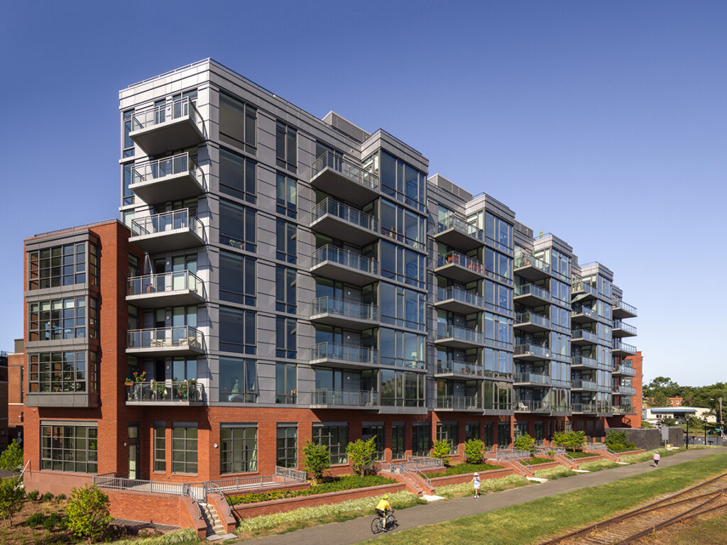
Not only a transition of massing, the style and materials of the building also provides a transition between a more traditional architectural language and a more contemporary one. The corner building together with the liner shoulders on the bar building relate to the traditional Colonial, Georgian, and industrial styles to be found in Old Town, and the trail face and upper stories above the shoulders of the bar building are contemporary curtain wall and will relate to the projected character of the PRGS redevelopment.
The corner building is composed of a grey metal panel grid system that suggests an industrial structural grid. The pavilion houses the arts and cultural anchor on the ground floor. Large storefront windows open the gallery space to the streetscapes and the pedestrian arts walk through the block. The units above are linked to the midrise via a glass bridge located at the second-floor level.
The shoulders are 4-story structures that line the midrise bar building on the street and paseo to step the massing down and transition between the midrise and the adjacent fabric. The shoulder liner buildings exhibit brick walls with ground floor cut outs for storefront windows. The hand-molded brick, red brick color, square bay windows, and warehouse style punched windows allow the buildings to relate to its surroundings.
The 8-story midrise is a glass curtain wall building fronting the trail. The building defines the edge of the city against the riverfront park and locates attractive condominiums here by offering unencumbered views of the river.
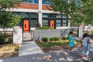
The ground floor program reinforces the transition from the streets to the trail/park. The ground floor of the corner building and the shoulders fronting the internalized arts walk contain arts gallery and studio spaces. These are fully-glazed storefront spaces with a 4-foot ornamental planted strip between the sidewalk and the storefront. Apartments with townhouse-like stoops and shallow door yards further occupy the ground floor of the shoulders. The ground floor facing the trail presents units with a different frontage condition. Here the apartments have deeper door yards with patios overlooking the trail. These patios are large enough to be furnished and used for outdoor entertaining, bringing activity and welcome ‘eyes on the trail’, making it not only safer, but making it feel safer.
CREATED BY
Rob Goodill, AICP
SHARE TO

Your Comment